
Wayfinding and the Interborough Express
By John Pegram[1]
Many riders on the proposed Interborough Express (IBX) line are expected to transfer to or from other transit lines. Ease of connections has been identified as an important factor by many potential IBX riders. The current MTA IBX survey and workshops are seeking views from the public about wayfinding, which is an important aspect of making connections. Here are a few examples of good wayfinding practices in transit systems.
Wayfinding Aids on Transit Vehicles
When riding a bus, train or tram, primary wayfinding thoughts of the rider include “Where do I get off” and “Where do I go next”? Here are a couple of helpful displays in a Munich S-Bahn train and a Tokyo metro train .
The overhead display depicted below is from a train on the S6 S-Bahn train headed for Ebersberg, as it approached Marienplatz, a major station in central Munich. The times of arrival and departure at Marienplatz are indicated at the top left. The exit door opening side is indicated at the top right. I believe that the arrow adjacent “Aufzug elevator” indicates that persons wanting to use the elevator should wait for the door on the other side of the train to open and go in that direction.
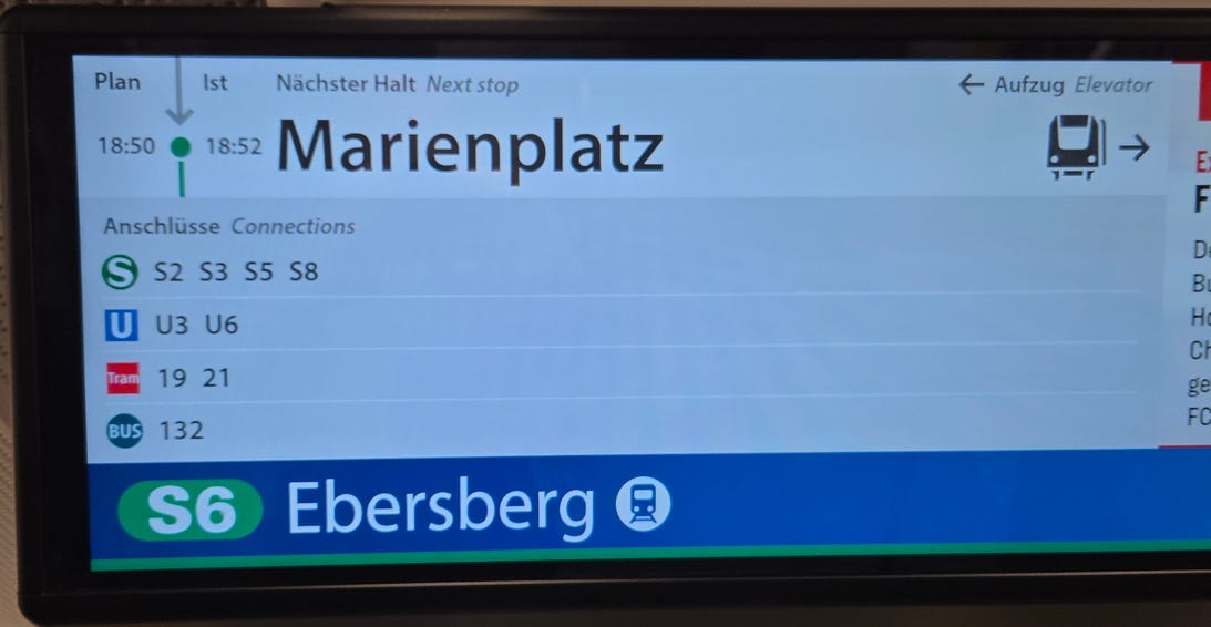
The availability of connections at Marienplatz to other S-Bahn, U-Bahn, bus and tram lines is also indicated. In some cases, such displays indicate the departure times of the connecting services.
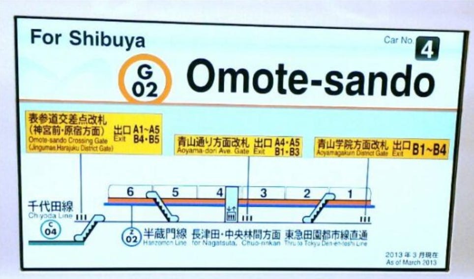
The Tokyo Metro trains often have displays over the doors, which indicate the directions to exits and connections at the next station, as shown, for example, in the photo below. Note that the display succinctly informs the rider of the paths to exits and connecting lines from her present car.
Station Displays, Maps and Signs
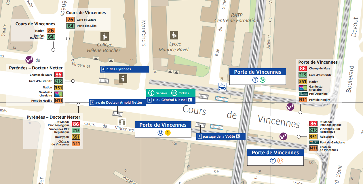
Some of the best examples of wayfinding maps and signs I have seen in transit systems were in Paris. Neighborhood maps (Plan du quartier) are posted at Metro stations and bus stops. Unlike the NYC Transit neighborhood maps I have seen, the ones in Paris indicate locations of bus stops. An example, below, is for the neighborhood of the Porte de Vincennes Metro station, located near the Eastern edge of the City of Paris. A blue circle indicates the approximate distance of a five minute walk from the Metro station.
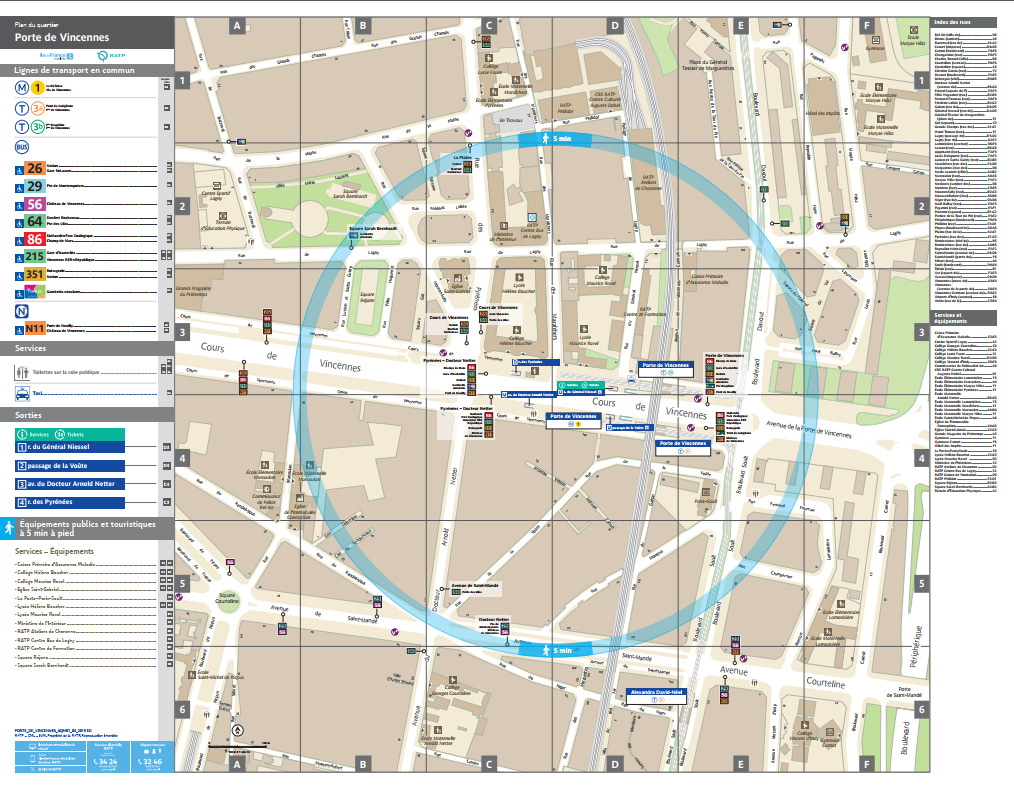
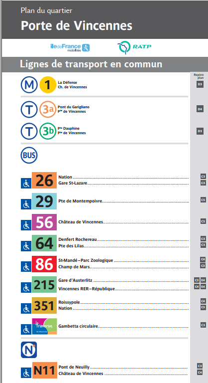
Before focusing on the map itself, I want to point out the useful information adjacent the map, portions of which are enlarged below. At the top left, nearby transit stops are listed. A Metro station is indicated, which is on Paris’ major East-West Line 1. Also listed are two tram lines (T3a and T3b), eight regular bus lines and one night bus line (N11). The locations on the map of stops on each line are indicated in the right-hand column.
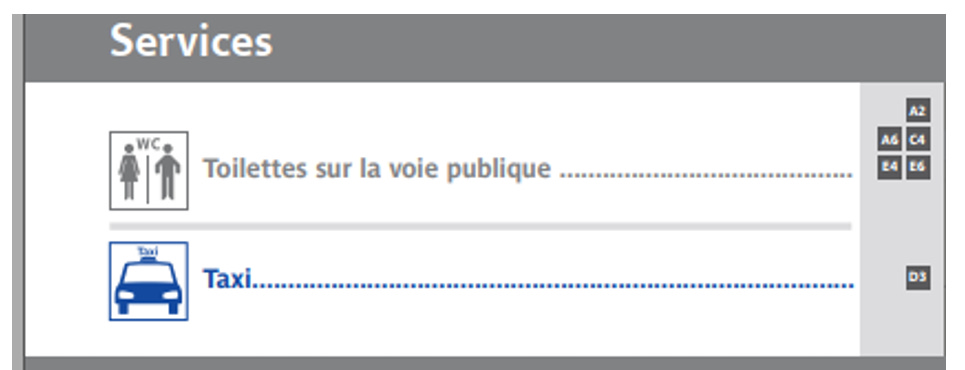
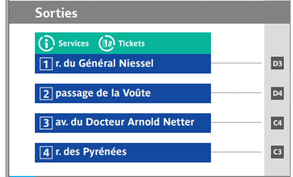
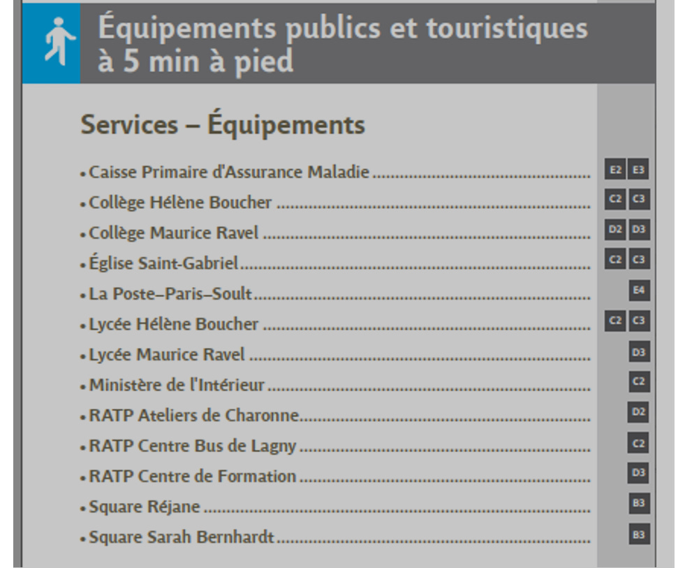
Below that, the symbols for public toilets and taxi stands are indicated, along with their map locations. Importantly, the Metro exits (Sortie) and ticket office are listed by street name, number and map location. Then, public and tourist facilities within a five-minute walk are listed.
Indices for local streets, services and facilities are on the right side of the map.
Focusing now on the center of the map, enlarged below, the location of each of the exits is clearly identified as are the locations of bus and tram stops (with destinations), and the taxi stand and public toilets. Exits with at least an up-escalator are indicated by a symbol on the exit label.
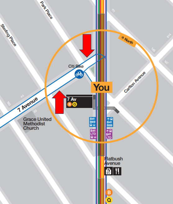
For comparison, I have copied below the neighborhood map for the NYC Transit 7th Avenue station on the B and Q subway lines in Brooklyn, followed by an enlargement of the immediate station area of that map.[2]
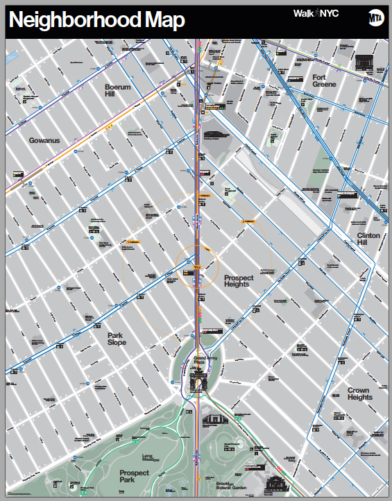
As compared with the Paris neighborhood maps, the NYC Transit ones cover a larger area (at a smaller scale) and do not indicate bus stop locations. For example, the 7th Avenue subway stop is a major transfer point for the B67 and B69 buses, running along 7th Avenue. The nearest bus stops to the subway station are on the north-northwest side of 7th Avenue between Flatbush Ave. and Park Place, and on the south-southeast side of 7th Avenue at Sterling Place, at the places I have indicated with red arrows on the enlarged map section above. It would be helpful for stations and bus stops in New York City to have larger scale maps indicating the locations of both station exits and bus stops.
Wayfinding Signs and Displays in Stations
Inside most of the Paris Metro stations I have visited, are signs indicating the location of exits and displays indicating the expected departure times for nearby surface transit lines. I have found both to be very helpful.
For example, the signs and display shown below were located near a pair of exits at the Porte de Vincennes Metro station. Route information in each direction is typically provided by strip maps, like the one for tram line T3a in this photo.
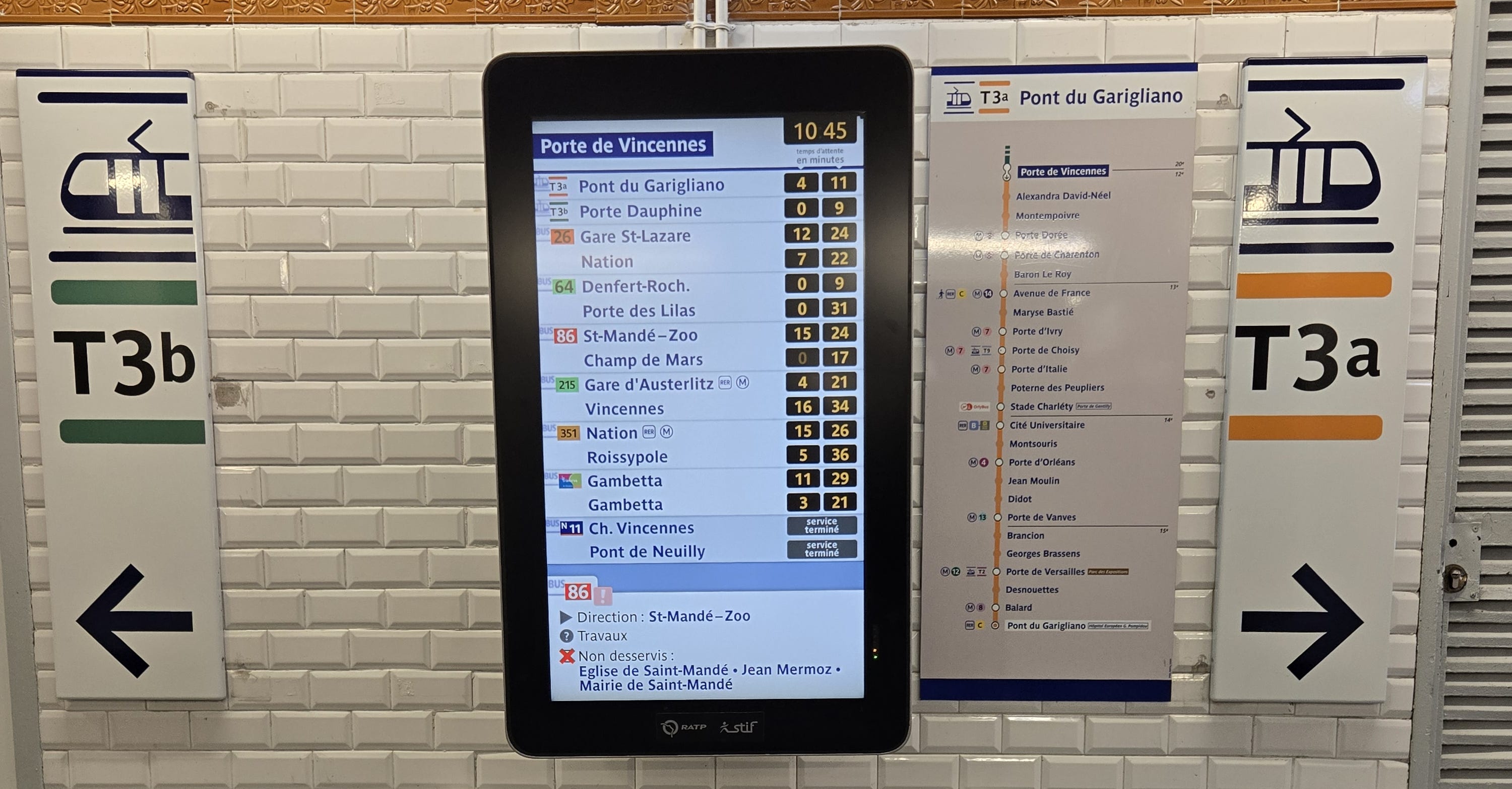
Examples of an exit sign and bus departure display from another Paris Metro station, Reuilly-Diderot, are shown below.
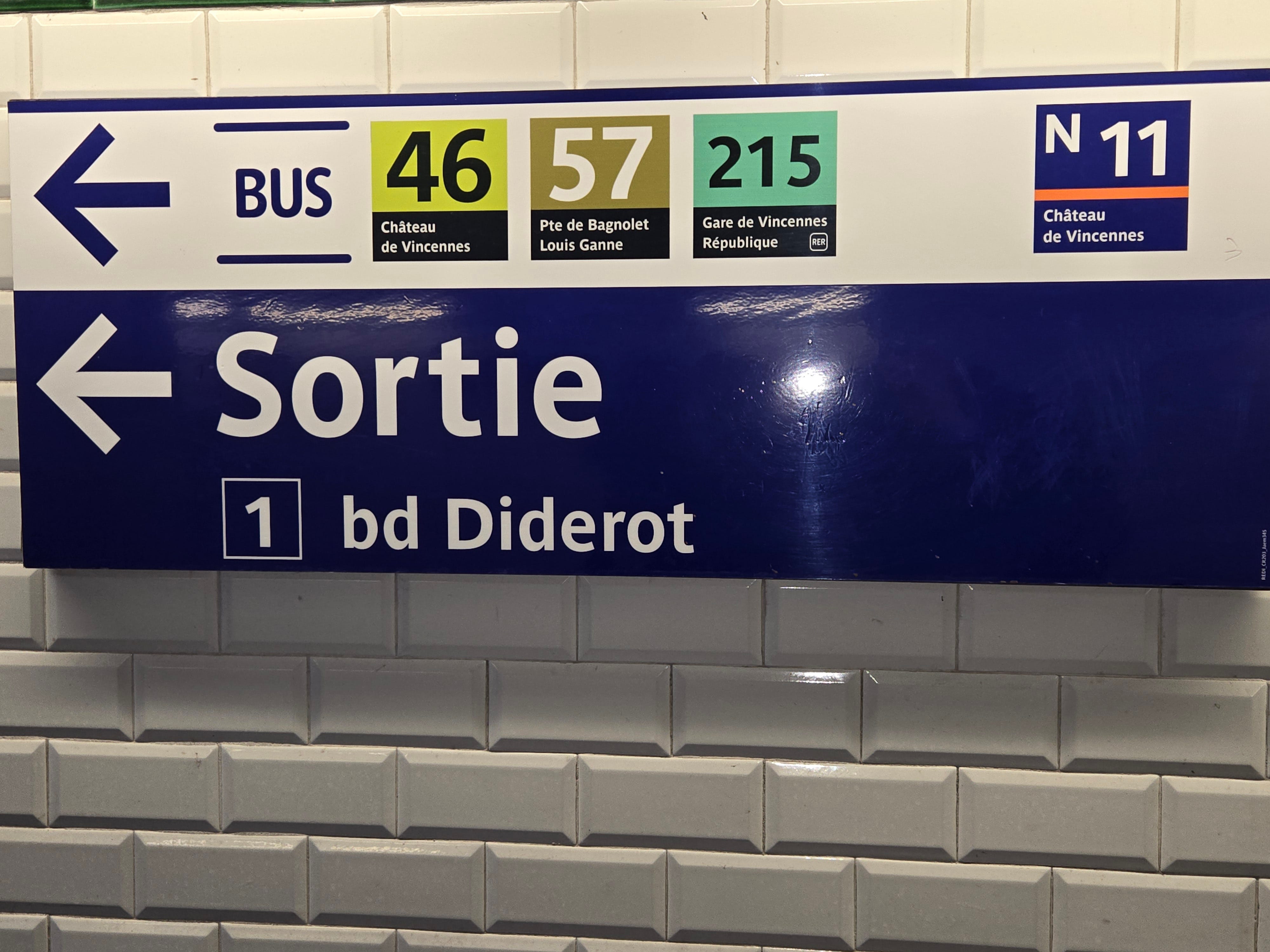
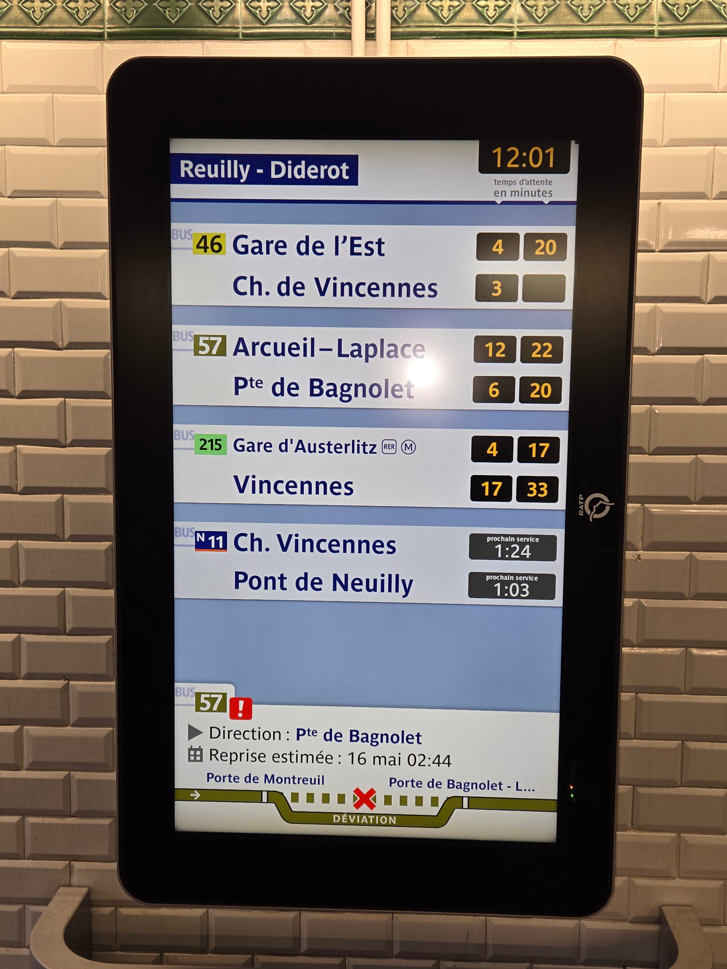
Here, the exit sign indicates the bus lines and their destination from the stop near that exit. The display indicates the next two departures in each direction at the nearby bus stops. In the case of night bus line N11, the display indicates when the next service (prochain service) will begin. At the bottom, the display reports on changes from normal bus service.
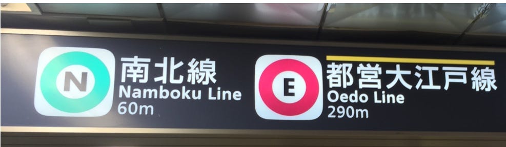
Another example of useful transit signage is from the Tokyo metro system. As shown below, overhead signs often indicate the distance for transfers to another line.
Another useful type of Tokyo metro sign, for which I have no photo, is a vertical list of stations on a line, posted on poles along the platform edge. These signs indicate the subway connections at each station and the car of the train on this line that will be closest to each connection. That permits riders to move to the platform location for the closest car for the connection while awaiting a train.
This article expresses the personal views of the author and does not express the views of his employer, or any client or organization. The author has degrees in law and physics, and has taken several engineering courses. After five years of work as an engineer, he has practiced law primarily in the field of patents for over 50 years, dealing with a wide variety of technologies. He is a life-long railfan and user of public transportation in the United States, Europe and Japan.
As usual a PDF copy of this article is attached.
[1] © John Pegram, 2026
[2] MTA Neighborhood Maps are available at: https://www.mta.info/maps/neighborhood-maps.
Thank you for showing these international examples - they are splendid & colourful! My Toronto Transit Commission & GO Transit are lagging behind a lot in onboard maps & transfer information, but they are improving.